Did you know the right color can change a room’s feel? Picking the perfect interior design color palette is key. It makes a space show off your personality and style.
We look at different interior home paint ideas to make any room special. You can use bright colors or amazing color mixes. For more ideas, see some living room paint color ideas.
Key Takeaways
- Selecting the right color palette is key to transforming a room.
- Vibrant hues and stunning color combinations can create an extraordinary space.
- Explore various interior home paint ideas to find the perfect fit for your home.
- Consider the ambiance you want to create when choosing colors.
- Check out living room paint color ideas for more inspiration.
1. Understanding Color Theory for Interior Spaces
The colors we pick for our homes greatly affect the mood and use of each room. Tools like the Sherwin-Williams Color Expert™ App help us find the perfect colors easily. This app uses AI to suggest colors that fit your space perfectly.
1.1 The Basics of Color Theory
Color theory is a deep study of color and how it affects us. It covers the color wheel, primary and secondary colors, and warm and cool tones. Knowing these basics helps us choose color schemes for home interiors that look good and work well.
1.2 Emotional Impact of Colors
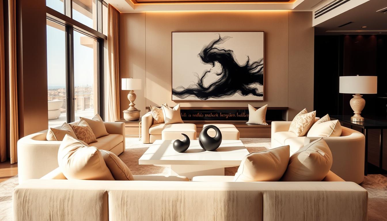
Colors can make us feel certain ways and change our mood. For example, blue can make us feel calm, which is great for bedrooms. Bright colors like red and orange can energize us, making them perfect for living rooms. It’s important to pick popular wall paint colors that match the mood we want in each room.
1.3 Warm vs. Cool Tones
Warm and cool tones are key in color theory. Warm tones, like reds and oranges, make spaces feel cozy. Cool tones, like blues and greens, can make areas feel bigger and calmer. Choosing between warm and cool tones helps us create a color scheme that looks good and feels right.
Using color theory, we can turn our homes into beautiful, useful spaces that show who we are. Whether we want a calm place to relax or a lively spot for fun, the right colors are crucial.
2. Selecting the Right Paint Finish
The finish of your paint greatly affects the look and feel of a room. It’s key to decide on a finish before picking a color. Seeing the color in person and in your space is crucial, as the finish changes how the color looks.
2.1 Glossy vs. Matte: What to Choose
There are two main paint finishes: glossy and matte. Glossy finishes make colors pop and can make rooms seem bigger. But, they show wall imperfections.
Matte finishes hide wall flaws with their flat, non-reflective surface. They’re great for ceilings and walls that don’t get a lot of wear. Yet, they’re harder to clean than glossy finishes.
| Finish Type | Characteristics | Best Use |
|---|---|---|
| Glossy | High sheen, durable, easy to clean | Trim, doors, high-traffic areas |
| Matte | Flat finish, hides imperfections, less durable | Ceilings, low-traffic areas |
2.2 The Role of Satin and Eggshell Finishes
Satin and eggshell finishes fall between glossy and matte. Satin has a moderate sheen, making it durable and easy to clean. It’s perfect for living areas and bedrooms.
Eggshell has a bit more sheen than matte but less than satin. It’s a good choice for areas needing more durability than matte but not as shiny as glossy.
When picking paint for your walls, think about the room’s use and wear. Always clean and patch walls before painting. This ensures a smooth finish, no matter the finish you choose.
3. Trending Interior Paint Colors for 2024
In 2024, homeowners have many paint color options. These colors fit different tastes and styles. This year, we see a mix of bold and calm colors.
3.1 Popular Shades This Year
This year, bold and vibrant colors are in. Some top colors include:
- Inky Blue: A deep, rich blue that adds luxury and calmness.
- Kelly Green: A vibrant, energetic green that brings freshness and life.
- Slate Blue: A muted, grey-blue tone that offers sophistication and serenity.
These colors are used on entire rooms. They make a big design statement.
3.2 Classic Colors Making a Comeback
Classic colors are also popular again. These timeless hues are updated for today’s homes:
- Soft Whites and Creams: These neutral tones create clean, minimalist spaces. They feel elegant and inviting.
- Warm Beiges: Beige and its variants are back. They offer a cozy and welcoming feel, great for living areas.
These classic colors are mixed with modern furniture and decor. This creates a unique blend of old and new styles.
4. Creating a Cohesive Color Palette
Designer Amber Lewis says it’s smart to start painting with a color you’re unsure about. This can lead to a cohesive color palette. A cohesive color palette is key for a harmonious interior design. It means picking colors that look good together.
To get this right, we can follow some guidelines. The 60-30-10 rule is a simple way to choose colors. It helps create a balanced color palette.
4.1 The 60-30-10 Rule Explained
The 60-30-10 rule is a decorating principle. It suggests using 60% of a dominant color, 30% of a secondary color, and 10% of an accent color. This rule makes for a balanced and harmonious color scheme.
For example, in a living room, we could use beige as the dominant color (60%). Then, blue for furniture and rugs (30%). And yellow for decorative items (10%). This makes the space balanced and appealing.
| Color Percentage | Color Role | Example Colors |
|---|---|---|
| 60% | Dominant Color | Beige, Cream |
| 30% | Secondary Color | Blue, Green |
| 10% | Accent Color | Yellow, Orange |
4.2 Finding a Balance with Neutrals
Neutrals are key in creating a cohesive color palette. They provide a calm background for other colors. Neutrals like white, gray, and beige are versatile and can match many colors.
When using neutrals, think about their undertones. This ensures they match the other colors in the room. For example, a warm beige goes well with earthy tones, while a cool gray pairs with blues and greens.
By using the 60-30-10 rule and balancing with neutrals, we can achieve a harmonious design. This approach lets us try different colors and techniques. We can even use creative home painting techniques to add texture and interest to our walls.
5. Accent Walls: Where and How to Use Them
Using color on one wall can change a room’s feel. Accent walls add color, interest, and can make a room look bigger.
Best Rooms for Accent Walls
Not every room is right for an accent wall. But, living rooms, bedrooms, and dining areas work well. They often have fireplaces or special details that pop with an accent wall. Think about the room’s light and colors before choosing.
Creative Patterns and Techniques
Accent walls can be more than just a color. You can try many patterns and techniques to make it stand out. Here are a few ideas:
- Ombre effects, where the color gradates from light to dark
- Geometric patterns, such as chevrons or herringbone designs
- Textured finishes, like those achieved with textured paint or materials
Let’s look at some popular techniques:
| Technique | Description | Best For |
|---|---|---|
| Ombre | Gradual color transition | Modern, minimalist spaces |
| Geometric Patterns | Shapes and patterns | Bold, statement rooms |
| Textured Finish | Adds physical texture | Rooms where you want to add depth |
An accent wall can make a room look better and create a focal point. It’s a great way to add boldness or interest. Accent walls are versatile and effective.
6. Using Color to Enhance Space
Color can change how we see space in our homes. The right interior home paint ideas can make rooms feel bigger, cozier, or more dramatic.

6.1 Tricks for Making Small Spaces Feel Larger
In small spaces, we want them to look bigger. Light, cool colors on walls help by making them seem to recede. Popular wall paint colors for small areas include soft whites, pale blues, and creamy grays.
Designer Minnette Jackson used a cloudy blue paint to make her long, narrow living room cozy. This shows how different shades can change a room’s feel.
| Color | Effect on Space | Best Used In |
|---|---|---|
| Light, Cool Colors | Makes space feel larger | Small rooms, hallways |
| Warm, Dark Colors | Creates cozy, intimate feel | Living rooms, bedrooms |
| Soft Pastels | Adds a touch of color without overwhelming | Children’s rooms, nurseries |
6.2 Dark Colors for Dramatic Effects
Dark colors can make a room feel cozy and intimate. They can also add warmth and comfort to big spaces.
Using dark colors on an accent wall or in furniture and decor adds depth. It makes a room interesting without feeling too much.
By choosing the right interior home paint ideas and popular wall paint colors, we can improve our home’s feel. We create spaces that are both beautiful and useful.
7. Eco-Friendly Paint Options
As we focus on making our homes more sustainable, eco-friendly paints are gaining popularity. The paint industry has introduced many products that are good for our health and the planet.
Benefits of Low-VOC Paints
Eco-friendly paints have low VOCs, which means they don’t release harmful fumes. Low-VOC paints reduce indoor air pollution. This makes them a better choice for people with breathing problems or allergies.
Using these paints also helps the environment. They reduce harmful chemicals during painting. Plus, many are made from natural ingredients and can break down easily.
Best Brands for Sustainable Choices
Many paint brands now offer eco-friendly options. Here are some top brands for sustainable paints:
| Brand | Product Line | Key Features |
|---|---|---|
| Benjamin Moore | Aura | Low-VOC, durable finish |
| Behr | Premium Plus ULTRA | Low-VOC, stain-resistant |
| Sherwin-Williams | ProMar 200 | Low-VOC, fast-drying |
| Farrow & Ball | Estate Emulsion | Low-VOC, high-quality finish |
When picking eco-friendly paint, check the labels. Look for Greenguard Gold or CARB Compliant. These show the paint meets strict VOC standards.
Choosing eco-friendly paints makes our homes healthier and helps the planet. As we look at new painting trends, using these paints is a smart move.
8. Room-Specific Paint Ideas
Different rooms in your home have unique purposes. The paint colors you choose should reflect that. Whether you’re looking to create a warm and inviting atmosphere or a bright and functional space, the right paint color can make all the difference.
Living Room: Warm and Inviting
The living room is often the heart of the home, where family and friends gather. For this space, consider warm and inviting colors like terracotta, golden brown, or soft beige. These earth tones can create a cozy atmosphere that encourages relaxation and conversation.
Kitchen: Bright and Functional
Kitchens are not just for cooking; they’re also spaces where people often gather. Bright and cheerful colors like white, light gray, or sunny yellow can make the kitchen feel more welcoming and functional. Consider using a semi-gloss finish to make cleaning easier.
Bedroom: Calm and Relaxing
Bedrooms should be sanctuaries, places where you can unwind and rest. Soft, calming colors like light blue, pale lavender, or muted green can promote relaxation. Avoid bold or bright colors that might interfere with sleep.
Bathroom: Fresh and Clean
Bathrooms benefit from fresh and clean colors that evoke a sense of hygiene and serenity. Shades of white, soft aqua, or pale gray can make the bathroom feel more spacious and relaxing. Consider a mildew-resistant paint to ensure durability.
By choosing the right paint colors for each room, you can enhance the overall aesthetic and functionality of your home. Remember, the key is to select colors that align with the purpose and atmosphere you want to create in each space.
9. Unique Paint Techniques to Try
Explore the world of unique painting to enhance your home decor. With creativity and expert tips, you can turn your space into a personal showcase.
Ombre and Gradient Styles
Ombre and gradient styles are trending in home decor. They involve blending colors from light to dark for a stunning effect. Start by picking colors that go well together. Use a sponge or special brush to mix them smoothly.

Think about the gradient’s direction when using ombre and gradient styles. You can go vertical, horizontal, or radial. For a soft look, pick colors near each other on the color wheel. For a bold statement, choose contrasting colors.
Stripes and Geometric Patterns
Stripes and geometric patterns add interest to your walls. They can highlight a room or add texture. Choose a pattern that fits your style, from simple stripes to complex designs.
To paint stripes, mark the wall with a level and pencil. Paint from top to bottom to avoid drips. For geometric patterns, use stencils or tape for sharp lines.
Here’s a comparison of different paint techniques:
| Technique | Description | Difficulty Level |
|---|---|---|
| Ombre | Gradating colors from light to dark | Moderate |
| Gradient | Blending multiple colors | Challenging |
| Stripes | Creating horizontal or vertical stripes | Easy to Moderate |
| Geometric Patterns | Using stencils or masking tape to create designs | Moderate to Challenging |
Using these unique paint techniques can add personality and style to any room. Whether you want a bold statement or a subtle look, there’s a technique for you.
10. Incorporating Texture in Paint Design
Adding texture to your paint design can make your walls more interesting. It brings depth and visual appeal to your space. This makes your interior design stand out and feel unique.
10.1 Using Textured Paints
Textured paints add a touchable element to your walls. They offer various finishes, from soft to bold. This lets you pick the right texture for your design.
- Enhanced Visual Interest: Textured paints make your walls stand out as a room’s centerpiece.
- Conceals Imperfections: Texture can hide small wall flaws like dents or scratches.
- Durability: Some textured paints last longer than regular paints, handling wear and tear well.
10.2 The Benefit of Faux Finishes
Faux finishes add texture to your paint design. They create decorative finishes that look like other materials, like marble or wood.
Benefits of Faux Finishes include:
- They give your walls a luxurious feel without the cost of real materials.
- They let you express your style with a unique look.
- They offer endless possibilities for creativity and new effects.
Using textured paints or faux finishes can boost your wall designs. It makes your interior design more vibrant and dynamic.
11. Tips for Painting Like a Pro
With the right tools and preparation, you can get a perfect paint job. Painting your home’s interior is more than just a fresh coat. It’s about making a beautiful, inviting space that shows your style.
Preparing Your Space
Before painting, prepare your space well. Move furniture away from walls and cover floors and furniture with drop cloths. Remove outlet covers and switch plates. Proper preparation is key for a great painting project.
Clean walls to remove dirt, grime, and grease for better paint adhesion. Fix holes or cracks with spackling compound and sand them smooth. This will help you get a professional finish.
Tools and Equipment Essentials
Having the right tools is crucial for a professional paint job. You’ll need high-quality paintbrushes, rollers, and extension poles. Also, a paint tray, roller covers, and a paint edger are essential.
| Tool | Description | Use |
|---|---|---|
| Paintbrushes | High-quality brushes in various sizes | Cutting in edges, corners, and detailed work |
| Rollers and Extension Poles | Roller covers and extendable handles | Covering large areas quickly |
| Paint Tray | Container for holding paint | Loading rollers with paint |
Choosing the best paint for interior walls is also important. Think about durability, finish, and color retention. For a professional look, use a primer for dark colors or bold patterns.
By following these tips and using the right tools and materials, you can get a professional paint job. Remember, the key to success is preparation and attention to detail.
12. Maintenance and Touch-Up Tips
To keep your interior looking its best, regular maintenance is crucial. We recommend inspecting your walls periodically for any signs of wear and tear. This includes fading or chipping paint, which can be a result of using outdated interior home paint ideas.
Keeping Your Walls Looking Fresh
Simple touch-ups can make a significant difference. For minor scuffs or marks, use a damp cloth to gently clean the area. For more pronounced damage, consider repainting the affected section with a paint that matches your original modern home painting trends.
When to Repaint Your Home
Knowing when to repaint is essential. If you notice significant fading, uneven color, or if the paint is starting to peel, it’s likely time for a fresh coat. Regular maintenance can extend the life of your paint job. But eventually, a new layer of paint will be necessary to keep your home looking its best.